The WHATWG Blog

Please leave your sense of logic at the door, thanks!

Make patent commitments for the URL standard

The WHATWG is starting down the road of getting patent commitments for its standards. You can be part of this! First, create an account with the W3C's community group system. Then, join the WHATWG community group. Then make the patent commitment by following the instructions on this page (pick the first radio button, then click "Record my choice"). That's all there is to it! Google, Mozilla, and Opera have already signed the patent commitment agreement. Anyone can sign up, but it's even more useful if you are an employee of a big patent-holding company and can convince your company to sign up!

Tags:
Posted in WHATWG | Comments Off on Make patent commitments for the URL standard

CSS Books & CSS Figures

Today we're happy to add two more specs to the WHATWG stable, Books and Figures! These are specifications focused on CSS features. Books provides ways to turn HTML document into books, either on screen or on paper. Using Books, authors can style cross-references, footnotes, and most other things needed to present books on screen or paper. Figures are also based on traditional publishing — it provides ways to float elements with respect to columns and pages, and describes how to wrap text around them.

Printing was part of the first CSS proposal in 1994, and many of these CSS features have been in use since the first paper book written in HTML and CSS (CSS — Designing for the Web) was published in 2005. Now, a decade later, bestsellers are routinely produced with CSS. There are currently two implementations of these specifications that are able to produce books: AntennaHouse and Prince. We hope that our continued work on these specifications will help existing implementations converge, and also encourage browsers to present web content as pages. Pages can be printed, stored as PDF files, or shown on screens. Many users will prefer pages to scrollbars, and these specifications will help make it happen.

As an example of a feature from Books, consider footnotes. Turning an element into a footnote is easy:

span.footnote { float: footnote } 

This can, with a few more styles, be formatted as:

Body text, with a superscripted footnote saying '[1]' in red, and under the body, a short line delimiting the body from text in a smaller font size, with the same red '[1]' indicating the footnote.

In another example, common newspaper and magazine layouts can be achieved with just a 10-line style sheet. Here's what this could look like:
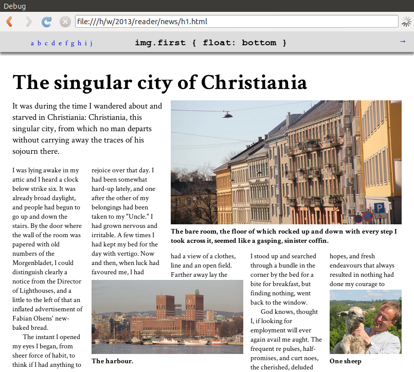
The page with five columns of body text, but with a paragraph in a larger font size spanning the first two columns to the upper left, an image with a caption spanning the last three columns at the top on the right, an image covering the second and third columns at the bottom, and a smaller image with a caption at the bottom right.

More screenshots and code examples are available.

Feedback on these specifications, like all our others, is most welcome, either on www-style, on WHATWG's mailing list, or as bugs in the bug database.

The features described by these specifications were previously published as part of a W3C CSS working group document that I wrote. Today we are moving the work to WHATWG, a W3C Community Group.

Posted in WHATWG | 6 Comments »

Relationship update on HTML Living Standard and W3C HTML5

In an email to the WHATWG mailing list Ian Hickson explained how the relationship between the WHATWG and W3C effort around HTML has evolved. It is recommended reading if you want to know the details.

In summary, we will remain focused on improving HTML and related technologies to address the needs of users, developers, and user agents. The W3C HTML WG has decided to focus on producing a snapshot: HTML5. We anticipate the net effect to be accelerated development of the HTML Living Standard.

Posted in W3C, WHATWG | 2 Comments »

Validator.nu HTML Parser 1.4 Available

A new release of the Validator.nu HTML Parser is available. The new version 1.4 contains minor adjustments to spec compliance and fixes for notable Java-specific problems (of the crash and infinite loop sort). Also, the parser is again available from the Maven Central Repository (groupId: nu.validator.htmlparser, artifactId: htmlparser, version: 1.4).

Upgrading to the newest version is recommended for all users of all previous versions.

Changelog:

Posted in WHATWG | 1 Comment »

The Future of the Web: My Vision (May 23, 2012)

I apologize for the longer than expected wait for this article, but now, we may continue.

The article below will pick up where Part 1 left off.


Article 1: Websites and Sectioning
Part 2: Styling


<warning>Warning: This article discusses the topic of <semantics>semantics</semantics></warning>

As we began with previously, we now have the basics down as to how to properly divide information into sections. This time, we will be looking into the second aspect of sectioning: Styling.

When a search engine or screen reader scans a website, it does so by evaluating the markup of the page. Humans however, view by way of sight. If we were to use absolutely no form of styling, it would be difficult, if not impossible, to logically divide an article into sections.

When we read through a webpage, several common features are used to guide us in logically separating it out:

  • Bolded text defining headings.
  • Heading text larger than the content below it.
  • Logical heading levels which decrease in size as it gets deeper.
  • Ocasionally indenting subsections and subheadings within their parents.

Web browsers of today will often do much of this work for you, but this is not always enough. Below, I will show you at most basic, the heading layout I choose to use when building a website.


<article>
<header><h1>Main Heading</h1></header>
<section class="topsection">
<h1>Top Heading</h1>
<p>Section Content</p>
<section class="subsection">
<h1>Heading</h1>
<p>Section Content</p>
<section class="subsection">
<h1>Heading</h1>
<p>Section Content</p>
<section class="subsection">
<h1>Heading</h1>
<p>Section Content</p>
<section class="subsection">
<h1>Heading</h1>
<p>Section Content</p>
<section class="subsection">
<h1>Heading</h1>
<p>Section Content</p>
</section>
</section>
</section>
</section>
</section>
</section>
</article>

Now obviously, this is more compact than any site would naturally be, and wouldn't use such simplified text. However, this perfectly demonstrates the decreasing levels of the font size of the heading. With each level, it gradually scales downward, starting from nearly 3 times larger than the content at highest, to the same size as the content at lowest.

To achieve this, we use the following CSS Code.


header > h1 { font-size: 2.75em; }
section.topsection { font-size: 2em; }
section > section { font-size: 75%; }
section h1 { font-size: inherit; }
section * { font-size: 16px; }
section h1, section p { margin: 0; }

As you can see, the above code generates a much more aethetically pleasing, and far more understandable result than one without styling.

At this point, you are probably asking: How can this actually apply to real life?

Well, below this I will explain.


Use in Practical Design

As mentioned above, the true power of this method is revealed when used in practical application.

In the figure below, I will demonstrate said power by use of the first chapter of the book Alice's Adventures in Wonderland by Lewis Carroll.

404
Styling used in Practical Application
Click Here for Citation

In the above sample, you can easily see the logically broken down structure of the chapter. You have the main article with its heading, the major logical division (the chapter), and two minor logical divisions (the sections). Although the subsections lack heading text, you can still tell that they are seperated. Even if you were to remove the row of stars, the spacing alone would be able to divide them.

And now, to show the code that makes it work:

HTML:
<article>
<header>
<hgroup>
<h1>ALICE'S ADVENTURES IN WONDERLAND</h1>
<h2>By Lewis Carroll</h2>
<h3>THE MILLENNIUM FULCRUM EDITION 3.0</h3>
</hgroup>
</header>
<section class="topsection">
<h1>CHAPTER I. Down the Rabbit-Hole</h1>
<section class="subsection">
<p>...</p>
<p>...</p>
<p>...</p>
<p>...</p>
<p>...</p>
</section>
<div class="sep">* * * * * * * * * * * * * * * * * * * *</div>
<section class="subsection">
<p>...</p>
<p>...</p>
<p>...</p>
</section>
</section>
</article>
Note: Text removed to prevent overcluttering.


CSS:
hgroup * { margin: 0; }
hgroup h1 { font-size: 2em; }
hgroup h2 { font-size: 1.5em; }
hgroup h3 { font-size: 1em; }
section { margin-bottom: 2em; }
section h1 { margin: 0.5em 0; }
p { text-indent: 1em; margin: 1em 0; }
p:first-of-type { margin-top: 0; }
.sep { font-weight: bold; margin: 0 1em 2em; }
Note: To show the full extent of the sample, this example uses a multi-tier heading for the article. This will be explained further in Part 3.

And here we have it. Together, the markup and the styling provides a neat, clean look which greatly improves readability. As well, it is written in semantic code which allows computers to properly understand its meaning.

In conclusion of this section, we have now learned the importance of sectioning, as well as how to properly style sections. These two concepts, when applied properly, could help create a much richer and more consistantly appealing world wide web in the coming future.

Next time, we will be discussing more advanced ascpets of this layout principle, such as multi-tiered headings and asides.

Until then, I hope that you have learned something new from this subject.

-Christopher Bright

Notes

  • Starting from now, if this article does not thoroughly desribe something for you, please leave a comment detailing your problem. I will do my best to update it.
  • I will soon be working out a method to rate the usefulness of this article, for future reference.
  • Any comments made will be taken into consideration for the future. I intend to make this beneficial for everyone, so all comments are accepted.
  • Examples will now be made within iframes, due to the possible large size of the content.

References

Alice's Adventures in Wonderland
Written by Lewis Carroll
Converted to ebook by David Widger of Project Gutenberg.
www.gutenberg.org/files/11/11-h/11-h.htm#2HCH0001
All rights go to their respective owners.

Updates

  • I have made a fix to the specific coding of the CSS, condensing it as much as possible, I believe.
  • Although further feedback will be needed to make a final decision, this may be the final entry of this series at this time.

Posted in Elements, Syntax, Tutorials | 7 Comments »